
The Ultimate Guide to Color Palette Guidelines: Crafting an Impactful Web Presence
Visual appeal plays a pivotal role in capturing and retaining audience attention. A well-crafted color palette is a cornerstone of visual branding, enhancing aesthetics and effectively communicating brand identity and values. This comprehensive guide delves deep into the guidelines for creating a compelling color palette that can elevate your marketing efforts, far beyond what you’d expect.
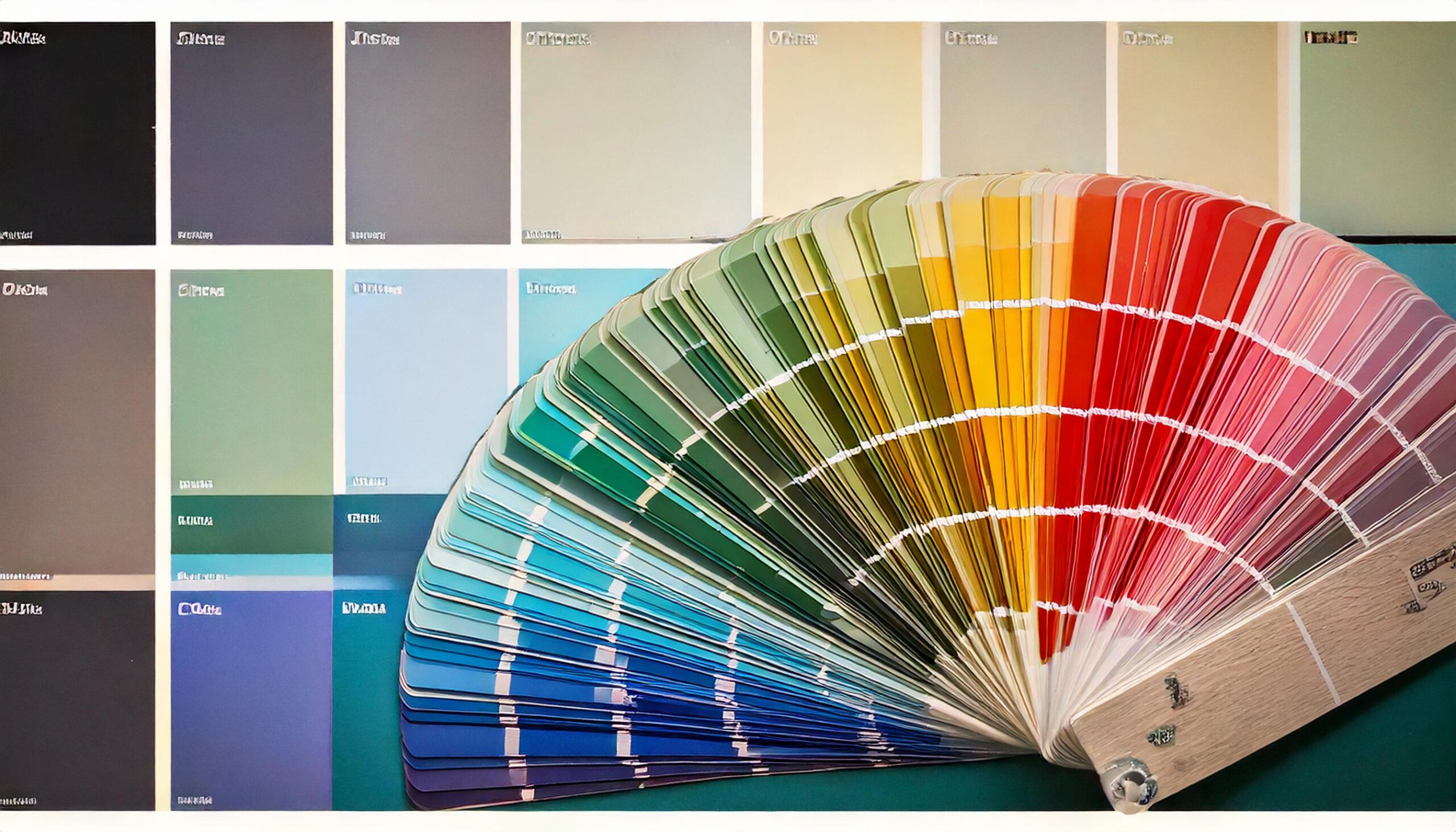
Understanding Color Theory
Before diving into the guidelines, it’s crucial to understand the basics of color theory. Color theory involves the study of how colors interact and the effects they have on perception and emotions. The color wheel, developed by Sir Isaac Newton in 1666, is a fundamental tool in color theory. It helps in understanding primary, secondary, and tertiary colors and how they can be combined.
The Basics of the Color Wheel
Colors are also categorized based on their warmth and coolness:
– Warm Colors: Red, orange, and yellow. These evoke warmth and energy.
– Cool Colors: Blue, green, and purple. These evoke calmness and tranquility.
Primary Colors: Red, blue, and yellow. These colors cannot be created by combining other colors.
Secondary Colors: Green, orange, and purple. These are formed by mixing primary colors.
Tertiary Colors: These are combinations of primary and secondary colors, such as red-orange or blue-green.
Importance of Color Psychology
Color psychology examines how colors influence human behavior and emotions. Different colors can evoke different feelings and associations. For instance:
– Red: Often associated with passion, urgency, and excitement.
– Blue: Conveys trust, calmness, and professionalism.
– Yellow: Represents happiness, optimism, and warmth.
– Green: Symbolizes nature, growth, and tranquility.
– Purple: Often linked to luxury, creativity, and wisdom.
– Black: Conveys sophistication, elegance, and authority.
– White: Represents purity, simplicity, and cleanliness.
Understanding these associations can help in selecting colors that align with your brand’s message and values.
Spring’s Must-Have Colors in Branding
Incorporating Vibrant Colors
Spring is synonymous with renewal and vibrancy. Here’s how you can incorporate some of spring’s must-have colors into your branding strategy:
Powder Blues
Embrace the soft elegance of powder blue hues. From creating calming backgrounds to text highlights, this shade brings a touch of sophistication and tranquility to your digital presence.
Buttery Yellows
Known as the original minimalist hue, buttery yellow offers warmth and optimism. Use this versatile shade for CTAs (Call to Action) buttons to grab attention or subtly in backgrounds to convey friendliness and cheerfulness.
Statement Reds
Red is a highly effective color for inducing urgency and excitement, making it ideal for sales announcements or limited-time offers. Incorporate it in headers or promotional graphics to demand attention instantly.
Dusty Pinks
Opt for the soft beauty of dusty pinks to evoke feelings of romance and elegance. Perfect for lifestyle brands or beauty products, this color adds a delicate charm to your posts and stories.
Bold Burgundys
Burgundy stands out as a prominent spring color, symbolizing sophistication and luxury. Ideal for high-end brands or products, it adds depth and richness to your social media visuals.
Lovely Lavenders
Lavender offers a whimsical yet elegant touch, making it a popular choice for fashion and beauty brands. Use it for branding elements or backgrounds to create a serene and sophisticated atmosphere.
Mint Greens
Mint green is fresh and inviting, perfect for eco-friendly brands or those looking to convey growth and renewal. Incorporate it in your visuals to create a crisp, clean look.
Immaculate Ivories
Ivorys and milky whites are timeless, adding a touch of sophistication and purity. Ideal for professional platforms like LinkedIn or corporate branding, these shades ensure a clean and polished look.
Rich Chocolate Browns
Elevate your visual branding with rich chocolate browns. These shades can add a luxurious and mature look to your social media aesthetics, perfect for brands conveying reliability and opulence.
Steps to Create a Cohesive Color Palette
1. Define Your Brand Identity
– Determine your brand’s core values and mission. Are you a fun, energetic brand, or do you convey professionalism and trust? Identifying these elements will guide your color selection.
– Understand your target audience’s preferences and cultural associations with colors.
2. Choose a Base Color
– Select a dominant color that reflects your brand identity. This color should be the foundation of your palette and used consistently across all platforms.
3. Select Complementary Colors
– Use the color wheel to choose complementary colors that enhance your base color. Complementary colors are opposite each other on the color wheel and create a vibrant look.
– Alternatively, opt for analogous colors, which are adjacent on the color wheel, for a harmonious and cohesive look.
4. Consider Neutral Colors
– Incorporate neutral colors like white, black, gray, or beige to balance your palette. Neutrals can be used for backgrounds, text, and secondary elements to ensure your primary colors stand out.
5. Test Color Combinations
– Create mock-ups of your social media posts, ads, and profile elements using your chosen colors. Ensure the combinations are visually appealing and convey the intended message.
– Test colors for readability, especially for text overlays. High contrast between text and background colors improves readability.
Applying the Color Palette Consistently
Consistency is key in establishing a recognizable brand identity. Here are some tips for maintaining consistency across your social media platforms:
1. Create Brand Guidelines
– Develop a comprehensive brand guideline document that outlines your color palette, including hex codes, RGB values, and CMYK values. This ensures that everyone involved in content creation uses the same colors.
2. Use Tools and Templates
– Utilize design tools like Adobe Color, Canva, or Coolors to create and save your color palettes. These tools often provide templates that help in maintaining consistency.
– Design templates for your posts, stories, and ads that incorporate your color palette. This makes it easier to create on-brand content quickly.
3. Maintain Visual Hierarchy
– Use colors strategically to create a visual hierarchy. Highlight important information or calls to action with your primary colors.
– Ensure that your color choices direct the viewer’s attention to the most crucial elements of your content.
4. Adapt to Different Platforms
– While maintaining consistency, be mindful of the nuances of different social media platforms. For example, Instagram requires more vibrant and visually appealing colors, while LinkedIn might benefit from a more professional and subdued palette.
Evaluating and Evolving Your Color Palette
The digital landscape is dynamic, and it’s essential to evaluate and adapt your color palette periodically.
1. Monitor Engagement Metrics
– Track engagement metrics such as likes, shares, comments, and click-through rates to understand how your audience responds to your color choices.
– Conduct A/B testing with different color schemes to identify what resonates best with your audience.
2. Stay Updated with Trends
– Keep an eye on design and color trends in the industry. While it’s important to stay true to your brand identity, incorporating trendy colors can keep your brand fresh and relevant.
3. Seek Feedback
– Gather feedback from your audience through surveys or social media polls. Understand their perceptions and preferences regarding your visual branding.
4. Make Incremental Changes
– If needed, make incremental changes to your color palette rather than overhauling it entirely. This ensures that your brand remains recognizable while adapting to new trends and insights.
Case Studies: Successful Color Palettes in Social Media Marketing
Learning from established brands can provide valuable insights into the impact of a well-designed color palette.
1. Coca-Cola
– Coca-Cola’s iconic red color is instantly recognizable and evokes feelings of excitement and energy. The consistent use of red across all marketing materials has cemented its brand identity globally.
2. Starbucks
– Starbucks uses a green palette, symbolizing growth and sustainability, aligning with their brand values and mission. The green mermaid logo is universally identifiable and associated with quality coffee.
3. Nike
– Nike’s use of black and white creates a sleek, modern, and professional look. These colors convey authority and sophistication, aligning with their brand message of high performance and innovation.
Conclusion
A well-crafted color palette is more than just a visual element; it’s a powerful tool that communicates your brand’s identity, values, and message. By understanding color theory and psychology, defining your brand identity, and applying colors consistently, you can create a compelling and cohesive visual presence on the web. Regular evaluation and adaptation ensure your color palette remains effective and relevant in the ever-changing digital landscape. Embrace the power of colors and let them tell your brand’s story in the most engaging and impactful way.
